

 SaaS UI/UX Design Agency for Products Design
SaaS product design that users understand, trust, and actually use
We don’t design for Dribbble. We design for users, buyers, and growth. If your product looks fine but feels confusing, slow, or hard to adopt, this is where we fix it.



What UI/UX design should do for SaaS
Good SaaS design does more than look clean



User Engagement
+45%
Reduce friction in onboarding
Make value obvious within minutes
Support activation and retention
Help sales demos land better
Scale with new features and users
Groie’s approach to SaaS product design
We work as a SaaS UX design agency that understands products, GTM, and real user behaviour

User intent and behavior

UX flows and information architecture
Visual design systems that scale


Design is never isolated from strategy
What we deliver
SaaS UI/UX Design Services
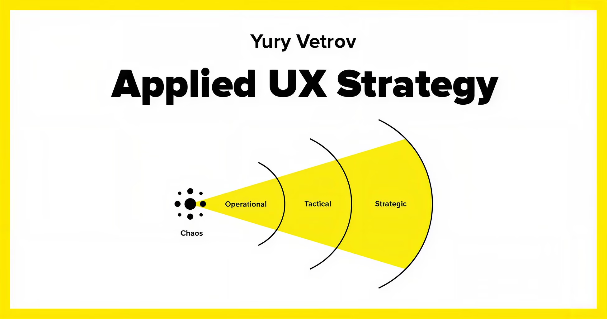
User journeys, flows, and interaction logic tied to product goals
Clean, scalable UI systems built for speed and consistency
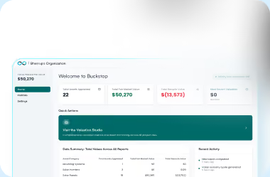
Dashboards, onboarding flows, core product screens, and edge cases
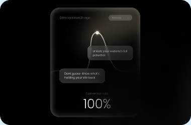
UX decisions that support signups, trials, and usage
Clear files, specs, and guidance for engineering teams
User journeys, flows, and interaction logic tied to product goals
Clean, scalable UI systems built for speed and consistency
Dashboards, onboarding flows, core product screens, and edge cases
UX decisions that support signups, trials, and usage
Clear files, specs, and guidance for engineering teams
MVP product design for startups
If you’re early-stage, we help you design the right MVP, not just a smaller product
As part of our MVP product design services, we

If you’re looking to hire MVP designer experts, this is where we start
Full-service brand design for SaaS brands
For teams building from scratch or rebranding, we also offer:

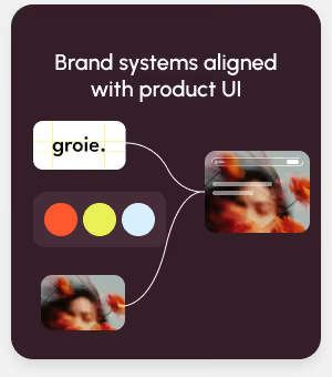

This ensures your brand and product feel like one system.
Our design process
01
Product and user understanding
Founder profile optimisation
UX structure and flows
We design journeys that make sense before visuals come in.
02
03
UI design and system creation
We create interfaces that are clean, usable, and scalable.
Feedback and iteration
We refine based on usability, clarity, and product priorities.
04
05
Handoff and support
We work closely with engineering to ensure smooth execution.
Who this is for
If users need explanations to use your product, design needs work.



A SaaS startup designing or redesigning a product
A founder preparing an MVP for launch or fundraising
A company scaling features without breaking UX
A team struggling with user adoption
Engagement model
Before engagement, we share a detailed SOW based on
Product stage
Scope and complexity
Design system needs
Timeline and team structure
Pricing depends on scope and depth.
Why Groie
Groie is not a generic SaaS design company.
We combine
SaaS product thinking
UX strategy
Visual design
GTM awareness
So design decisions support growth, not just aesthetics.
Ready to design a product users actually understand?
If you’re looking for a SaaS UX design agency that understands products, users, and scale, let’s talk.
The most
‘frequently asked questions’
